
In this article
title: "Commercial Real Estate Reporting: Why Static Dashboards Aren’t Enough" slug: "/resources/cre-reporting-static-dashboards/" primary_keyword: "commercial real estate reporting static dashboards" pillar: "P4 — AI Reporting for Commercial Real Estate" intent: "Commercial investigation" ---
A dashboard can tell a commercial real estate team that occupancy fell, NOI moved, or lease expirations are approaching. That is useful, but it is not the same as producing a report that explains what changed, why it changed, what deserves attention, and what a specific audience should do with the information.
That distinction matters because CRE reporting rarely ends with a chart.
Asset managers turn portfolio data into monthly and quarterly narratives. Finance teams reconcile variances and prepare management reporting. Executives want the few movements that matter, not another screen full of KPI tiles. Investors, lenders, and other stakeholders may need a packaged deliverable with a clear period, defined metrics, supporting detail, and a version that can be reviewed later.
Static dashboards remain valuable for recurring monitoring. The problem appears when a team expects the dashboard to do the work of analysis, explanation, and delivery as well.
This article explains where dashboards fit in commercial real estate reporting, where they start to fall short, and how a modern workflow can combine dashboards, conversational analysis, and generated deliverables without treating any one of them as a universal replacement.
Key takeaways
- A dashboard is primarily a monitoring interface for predefined metrics, while reporting adds analysis, selection, narrative, and audience-specific packaging.
- Static dashboards work well when the questions are recurring, the metrics are already defined, and the user mainly needs to monitor movement.
- Reporting becomes harder when users need ad-hoc follow-ups, explanations of variance, cross-source investigation, or a finished PowerPoint, Excel, or Word deliverable.
- A strong CRE reporting workflow separates three jobs: monitor the portfolio, explain what changed, and deliver the result in the format the audience needs.
- Dashboard limitations often come from data definitions, source quality, and workflow design rather than from visualization technology itself.
- Modern reporting should preserve source context, metric definitions, permissions, and version history instead of treating a generated narrative as self-validating.
What is the difference between a dashboard and commercial real estate reporting?
A commercial real estate dashboard is a visual interface for monitoring selected metrics, trends, exceptions, and portfolio activity. Commercial real estate reporting is the broader process of turning that information into an interpreted, reviewable, audience-specific output.
The easiest way to see the difference is to look at the job each one performs.
A dashboard answers predefined questions about occupancy, NOI, lease expirations, CapEx, budget variance, and other portfolio metrics.
A report goes further by explaining what changed, which properties or drivers matter, what evidence supports the finding, and how the result should be packaged for its audience and reporting period.
A dashboard is therefore one component of a reporting system, not necessarily the reporting system itself.
Where static dashboards work especially well
Static or largely predefined dashboards deserve more credit than they often receive in AI conversations.
They are effective when the organization has stable questions and stable definitions. A portfolio manager who opens the same page every Monday to review occupancy, collections, NOI, leasing activity, and budget variance benefits from a consistent interface. Everyone can look at the same KPIs using the same visual definitions.
Dashboards are also strong at trend detection and portfolio scanning. Filters can move users from portfolio level to region or property, while standardized views make recurring reviews consistent.
They are especially useful for:
- recurring operating reviews
- KPI monitoring
- exception tracking
- portfolio comparisons
- drill-down into known dimensions
- standardized management views
Why monitoring is different from reporting
The central distinction is monitoring versus explanation.
Suppose a dashboard shows that a property's NOI is down compared with the prior quarter. The dashboard has done its job if it surfaced the movement clearly.
But the reporting task has only started.
The next questions may be:
- Which revenue line changed?
- Did occupancy change?
- Did a major tenant move out?
- Were concessions recognized differently?
- Did operating expenses increase?
- Was there a CapEx timing effect?
- Is the comparison using the same property population?
- Is the result based on the same accounting definition used in the prior period?
Those questions are analytical. They require investigation rather than simply displaying the original KPI.
The reporting process then adds another layer: deciding which findings belong in the final deliverable and how much context the audience needs.
That is why a dashboard can be accurate and still leave a reporting team with substantial manual work.
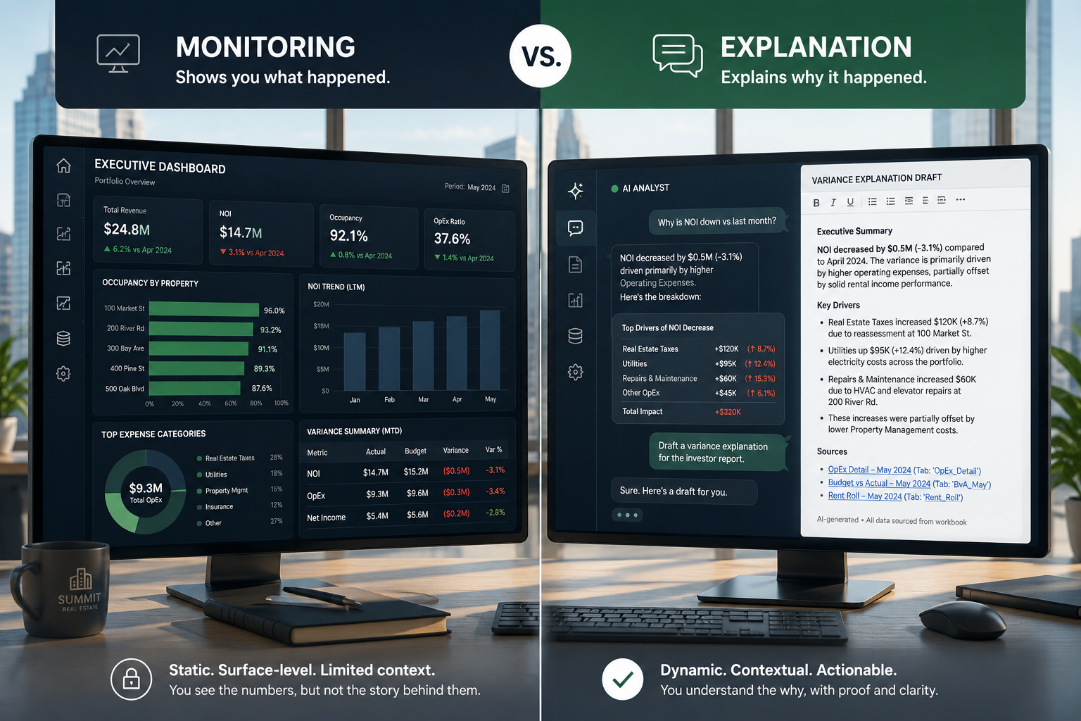
The Monitor–Explain–Deliver Model
A useful way to structure modern CRE reporting is the Monitor–Explain–Deliver Model:
| Stage | Primary job | Typical output | Best-fit tool |
|---|---|---|---|
| Monitor | See what is moving or needs attention | KPI cards, trends, exception lists, tables | Dashboard |
| Explain | Investigate causes, compare periods, test definitions, answer follow-ups | Analysis, supporting tables, cited findings | Conversational analysis, BI analysis, analyst workflow |
| Deliver | Package approved findings for a specific audience | PowerPoint, Excel, Word, recurring report | Reporting workflow and document-generation tools |
Each stage has a different objective. A dashboard should not be judged by whether it writes an investment committee narrative, and conversational analysis should not be treated as a substitute for standardized KPI definitions. The better question is where each task belongs.
What dashboards struggle to answer
The first limitation of static dashboards is question variety.
A dashboard is designed around questions known in advance. But reporting cycles generate second-order questions that were not part of the original dashboard specification.
For example:
"Our office portfolio occupancy is down 240 basis points. Which properties account for most of the decline, and are those properties also driving the increase in projected tenant downtime?"
That is not a single KPI lookup. It combines a comparison, attribution, a second metric, and a relationship between two business concepts.
A second limitation is narrative selection. A dashboard can display twenty important changes. A report may need to select the three that matter most for the audience.
A third is context. A number without the right period, population, definition, or comparison basis can produce a misleading narrative even when the number itself is technically correct.
A fourth is packaging. A dashboard is a destination for analysis. A PowerPoint deck or management report is a deliverable that may need a defined structure, commentary, selected exhibits, and an identifiable reporting period.
They are different tasks with different success criteria.
Dashboard vs. conversational analysis vs. generated report
The three approaches are complementary rather than mutually exclusive.
| Capability | Static dashboard | Conversational analysis | Generated report |
|---|---|---|---|
| Recurring KPI monitoring | Strong | Moderate | Moderate |
| Predefined visual trends | Strong | Moderate | Strong |
| Ad-hoc follow-up questions | Limited | Strong | Moderate |
| Investigating a variance | Moderate | Strong | Strong |
| Comparing arbitrary portfolio slices | Depends on design | Strong when data supports it | Strong when workflow supports it |
| Selecting the most important findings | Limited | Stronger | Stronger with human review |
| Narrative explanation | Limited | Strong | Strong |
| Audience-specific packaging | Limited | Moderate | Strong |
| PowerPoint output | Usually external/manual | May require another workflow | Core use case |
| Excel analysis output | Often export-based | Possible | Core use case |
| Versioned deliverable | Usually not the primary function | Not the primary function | Core use case |
| Source traceability | Depends on implementation | Should be explicit | Should be preserved |
This table points to a practical architecture.
Keep dashboards for the questions the organization already knows it needs to monitor. Add an analytical layer for the questions that emerge during review. Then use a reporting workflow to turn approved findings into the final deliverable.
What changes when a reporting team works this way?
Consider a monthly asset-management workflow.
The dashboard flags three properties with meaningful NOI variance. An analyst or asset manager then asks:
"Break down the NOI variance by revenue and operating expense, compare each property with the prior month, and identify which line items contribute most to the movement."
The next question may be:
"For the two properties with the largest decline, check whether occupancy and lease-expiration activity changed in the same period."
The analysis can then produce a small set of cited findings and supporting tables. Only after review does the team create the monthly report:
- executive summary
- portfolio KPI page
- variance analysis
- property-level exceptions
- leasing or occupancy context
- selected charts
- appendix or supporting detail
The important change is that the report is created from the analysis, rather than treating the dashboard as the final artifact.
Why source citations matter in reporting workflows
A narrative can sound reasonable and still be wrong.
That is especially dangerous in CRE because the same label can hide different definitions. "Occupancy" could refer to physical, leased, or economic occupancy. A portfolio comparison can change depending on the property population used. A lease expiration view may depend on effective dates, amendments, or how the underlying lease data was abstracted.
For that reason, a useful reporting workflow should preserve the relationship between a finding and the source information behind it.
Source citations can help a reviewer answer:
- Which dataset produced this number?
- What property or tenant population was included?
- What period was used?
- Which filters were applied?
- Which definition supported the metric?
- Can the underlying information be inspected before the statement is approved?
Where versioning becomes important
Dashboards usually present the current state of a dataset. Reporting introduces a different requirement: what was actually delivered at a particular point in time?
A quarterly report may be reviewed several times. Numbers can change after a data refresh. Commentary can be revised. A table can be replaced. An executive summary can be shortened.
Those changes create a versioning problem. A reporting workflow should distinguish the source analysis, draft, revised deliverable, and final approved version so the team can reconstruct what was presented during a specific reporting cycle.
Where this falls short
A stronger reporting workflow does not eliminate the underlying weaknesses in the data stack.
First, bad source data still produces bad analysis. A polished report cannot repair a wrong lease status, incomplete rent roll, incorrect property hierarchy, or inconsistent financial mapping.
Second, metric definitions still need ownership. An AI or reporting tool cannot infer a firm's preferred definition of same-store NOI, occupancy, or a portfolio population simply because the label exists in a database.
Third, cross-source joins can create subtle errors. Property, tenant, lease, accounting, and budget data often exist at different grains. A report can look plausible while double-counting or misaligning records.
Fourth, generated output still needs human review, especially for investor, lender, legal, or fiduciary reporting. Fifth, dashboards may still be best for high-frequency monitoring; replacing them wholesale can make routine review slower.
The goal is not to eliminate dashboards. It is to stop asking them to do every job.
Build reporting around the work
Connect dashboard signals, governed analysis, and final deliverables in one CRE workflow.
Talk to BayaanHow to decide what belongs in a dashboard and what belongs in a report
Use a simple decision test.
If the question is recurring, predefined, and monitored frequently, it probably belongs in a dashboard.
If the question is ad-hoc, explanatory, comparative, or investigation-heavy, it belongs in the analytical workflow.
If the result needs to be reviewed, packaged, distributed, and referenced later, it belongs in the reporting workflow.
A practical operating model looks like this:
Dashboard
Monitor occupancy, NOI, leasing, CapEx, budget variance, and other recurring indicators.
↓
Analysis
Investigate exceptions, answer follow-ups, compare periods, test definitions, and trace findings to source data.
↓
Reporting
Select the relevant findings and produce the audience-specific deliverable.
That separation reduces the pressure to turn one interface into a universal reporting system.
What a modern CRE reporting stack should evaluate
When evaluating a commercial real estate reporting workflow, look beyond visualization quality. Test whether it can:
- support the actual CRE data model and metric definitions
- handle ad-hoc questions without creating a new dashboard for every request
- connect findings to source data
- enforce appropriate permissions
- move from analysis into PowerPoint, Excel, or Word
- preserve revisions and reporting-period context
The strongest setup is usually dashboard + analysis + reporting, with clear boundaries between the jobs.
Where Bayaan fits
Bayaan is positioned around the part of the workflow between connected business data and finished business work. It can let CRE teams ask natural-language questions of live business data with the source cited on the answer, then generate PowerPoint, Excel, or Word output from a prompt or upload. It also includes governance capabilities such as role-based access control, audit logs, per-project knowledge bases, source citations, and multi-model routing.
That makes the Monitor–Explain–Deliver model useful as a way to think about where a governed AI workspace can complement existing dashboards rather than replace them.